Project Overview

A geo-broadcasting platform that enables content creators to generate, distribute, and control their rich media.

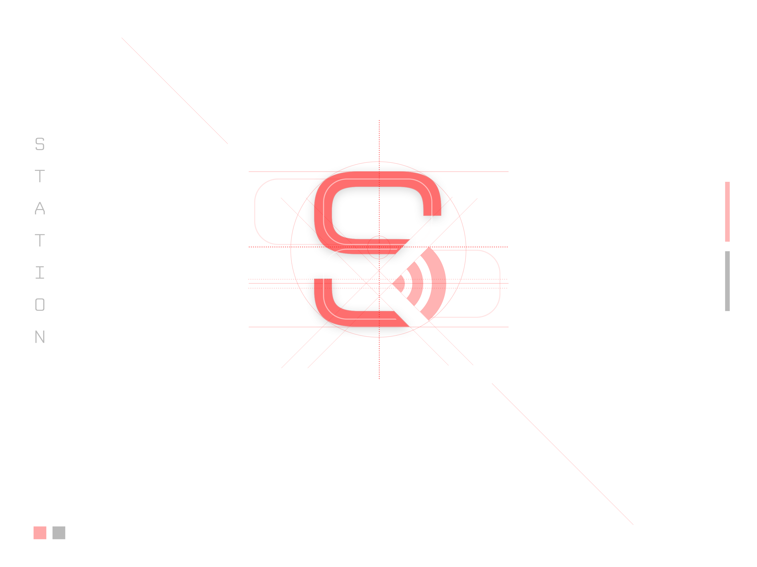
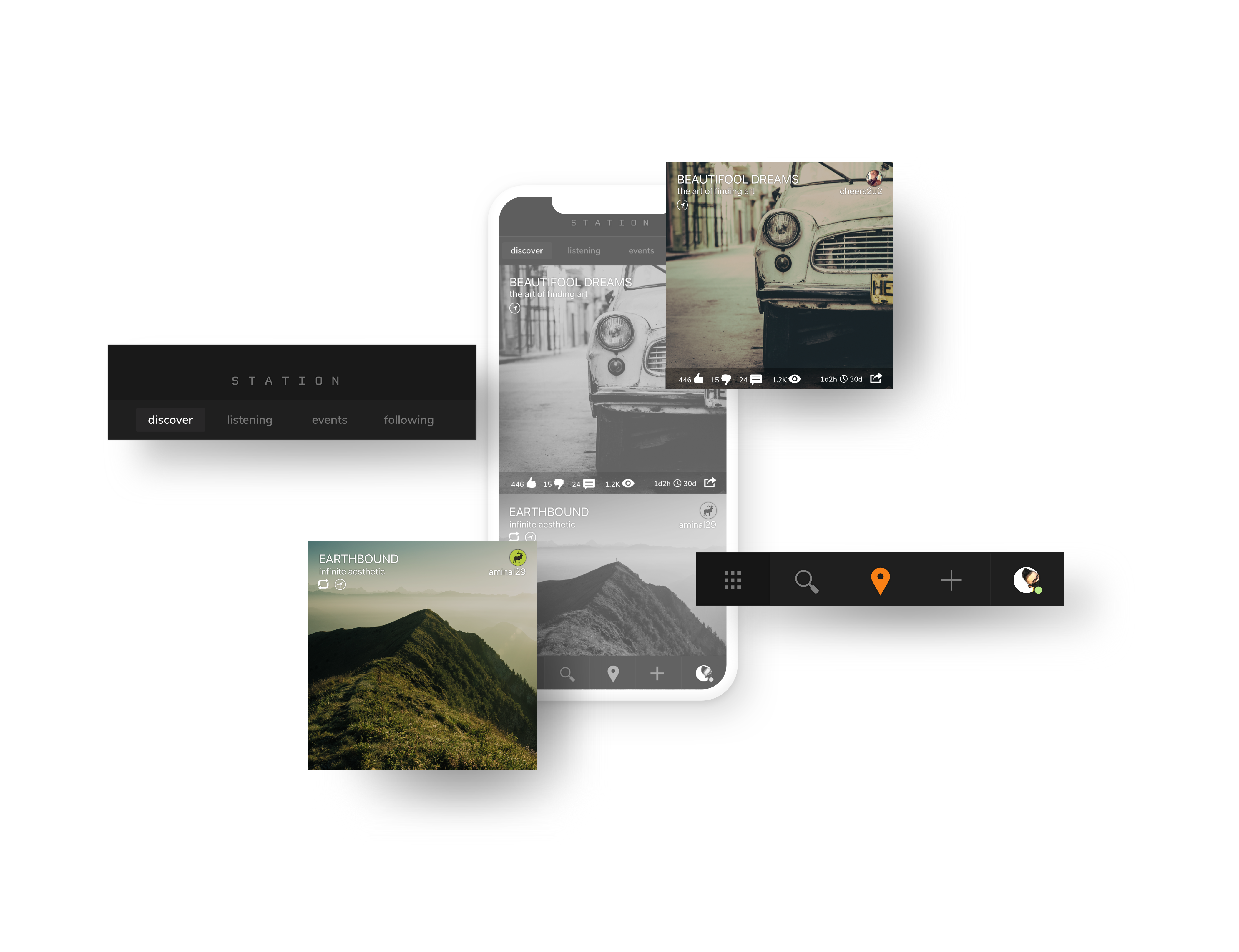
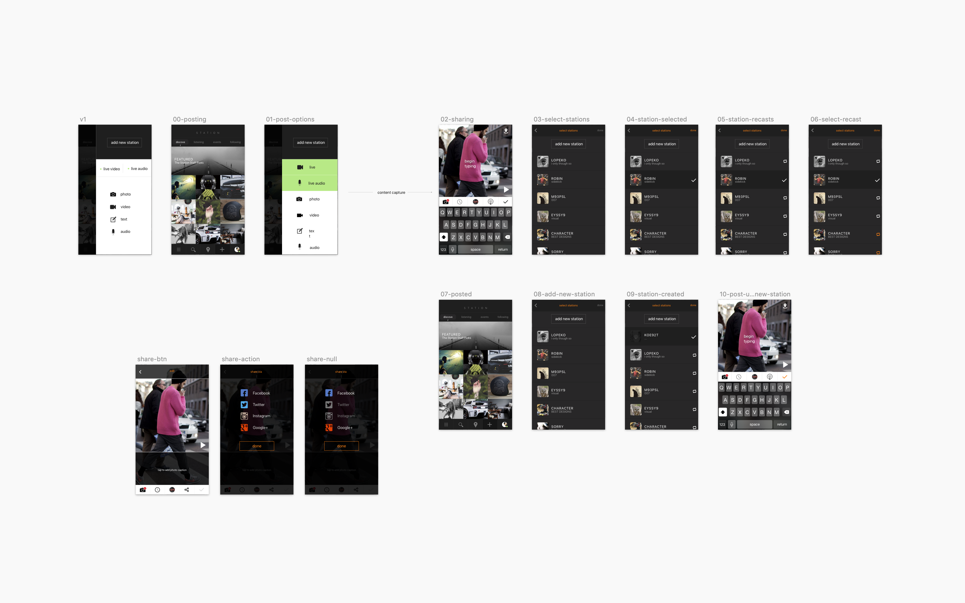
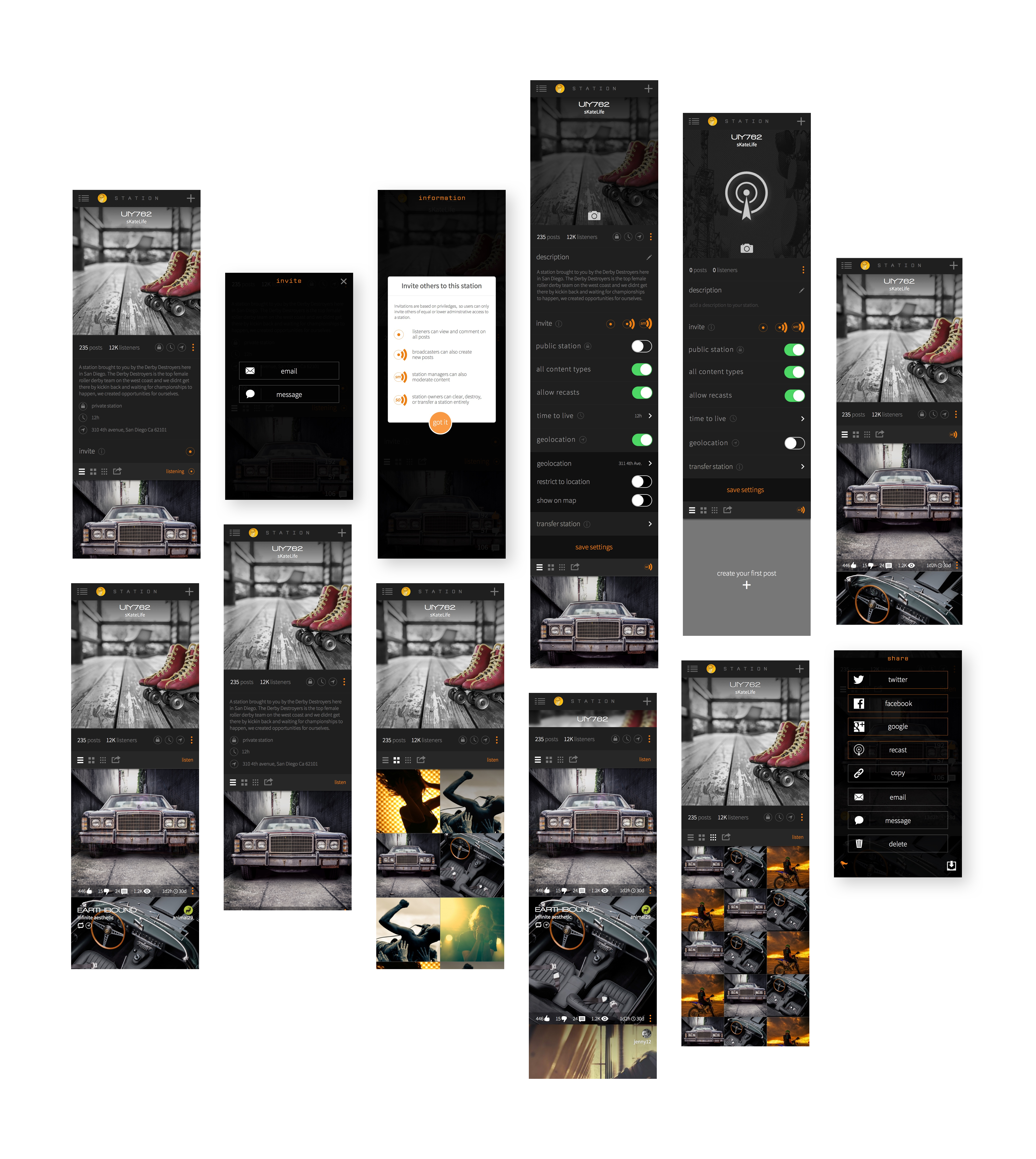
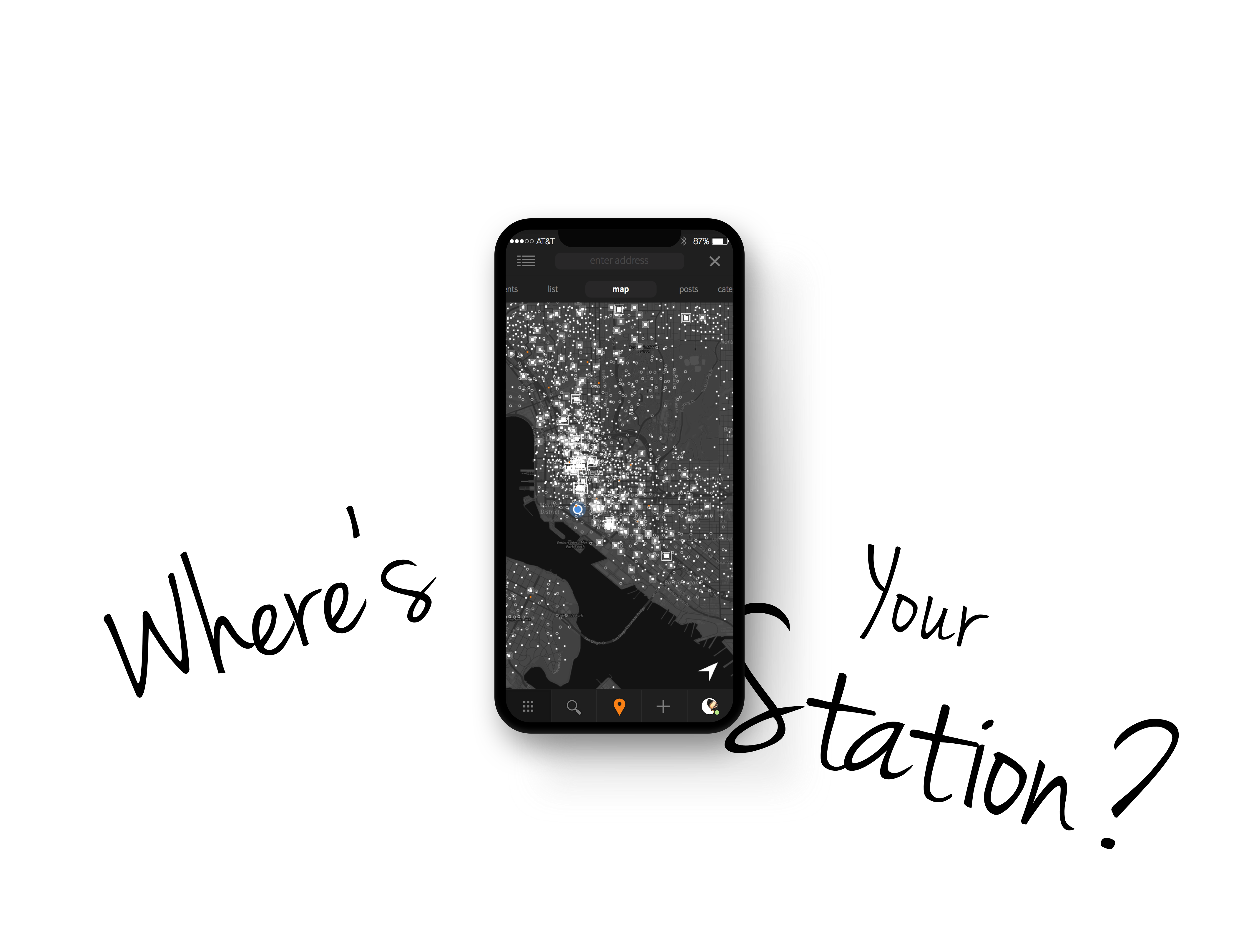
Station was a mobile application that started out as an idea from one of Webhomes’ former clients. Eventually, the majority of the agency resources would be focused on building the app and growing its brand. Key focuses of the app were anonymity and creative content controls, which were kept as themes of the overall branding.

Following a Series A funding approval, development was scaled up to double its size for both iOs and Android platforms. Design was handled entirely by the Webhomes agency designers and managed by me as the Design Lead.

Client

Webhomes Startup

What I Did

Design Management, Strategy, Product Design, UX, Marketing

A Brief Look Inside

Apple Store Preview

Branding

The Mark

The colors chosen were specific to those aforementioned themes: Anonymity & Creative Content Control. We wanted colors that were energetic and complimentary to darker interfaces. In many instances the brighter hues were used directly over black variants to really boost the contrast and visibility.

Color Palette
Night Rider

#373a3c

Osaka

#bf1600

Cali Sunset

#f98015

Candy Corn

#e25614

Slime Green

#b0cd3b

Overcast

#ebebeb

Typography
Jura Medium

A B C D E F G H I J K L M N O P Q R S T U V W X Y Z

a b c d e f g h i j k l m n o p q r s t u v w x y z

Lato Regular

A B C D E F G H I J K L M N O P Q R S T U V W X Y Z

a b c d e f g h i j k l m n o p q r s t u v w x y z

Interface

Early UI Concept

v1 Flow

The series of images below were created as part of our initial user flow. Although the assets appear rather developed, they were mostly conceptual. We knew generally what functionality was needed from view to view and the visuals were a necessary part of painting the picture for potential partners.


1
1

v2 Updates to UI

After nailing down some real requirements for each view, we got to work on making a kit for the UI. Two major additions to the app were the upper carousel nav and collapsing footer nav. This allowed the user access to a great deal more functionality as well as the ability to swipe between content views naturally, way back before it was a standard pattern as it is today.

A focal point in the footer nav is the geolocate toggle button. This is the pin icon highlighted in Cali Sunset which is used to turn the geolocation filter on and off. When turned on, all content would be filtered to your location settings.

Top Carousel Nav
View Switcher: Square / Grid / Thumbs
Active GeoLocation Filter

Content Creation

Next we focused on how users were meant to capture and create their content. Our first priorities were images, text, and text over images. Once we could establish that functionality succinctly across iOs and Android, we would scale up to rich media and live media.

We considered this type of progression necessary knowing that we would next be aiming for a seamless sharing experience to various social platforms.

Single Station Controls

Continuing to layer on the complexity, we added a multitude of customizations and controls to a created station. Things like broadcast radius, ‘time-to-live’, privacy, and Custom Station ID’s are a few of the major additions to the UX.

This also marked a good point to handle all the null / no data  states throughout the app. With every allowable user customization comes a required null state design. Such is the requirement for a flexible and modular design.

Final Notes

Station’s journey from simple idea to multi-platform app, in retrospect, was challenging at every milestone. It seemed like overnight a small team of UX designers were tasked with creating a native experience for both iOs and Android devices. This was a monumental task for the motley crew of designer/developers in charge of the small order of the Webhomes portfolio. 

In the beginning, everything was 110% and due yesterday. Frenetic is the only way to suitably describe the dev and design teams those first 6 months. We had new partnership every week which meant incorporating new features in the app. Promoting and pitching the product required us to create, to some degree, ‘vapor ware’ all whilst designing the actual product..

The team’s resources were quickly depleted – split between designing for iOs and Android, brand development, marketing materials, asset creation for the dev team, and Webhomes agency work. Needless to say, this was too high a workload given the amount of resources available.

In the end, an incredible idea collapsed due to poor planning and a lack of resources. Defining a clear overview of the entire application and its functionality would have allowed us to have firm requirements to work from. What I did learn was the level of output possible with a determined and motivated team. Credit to my team who day in and day out crushed it without question. #rainerandall #brandonshepard #jimgassman