Project Overview

Rebranding one of the nation's largest companies in the addiction treatment space.

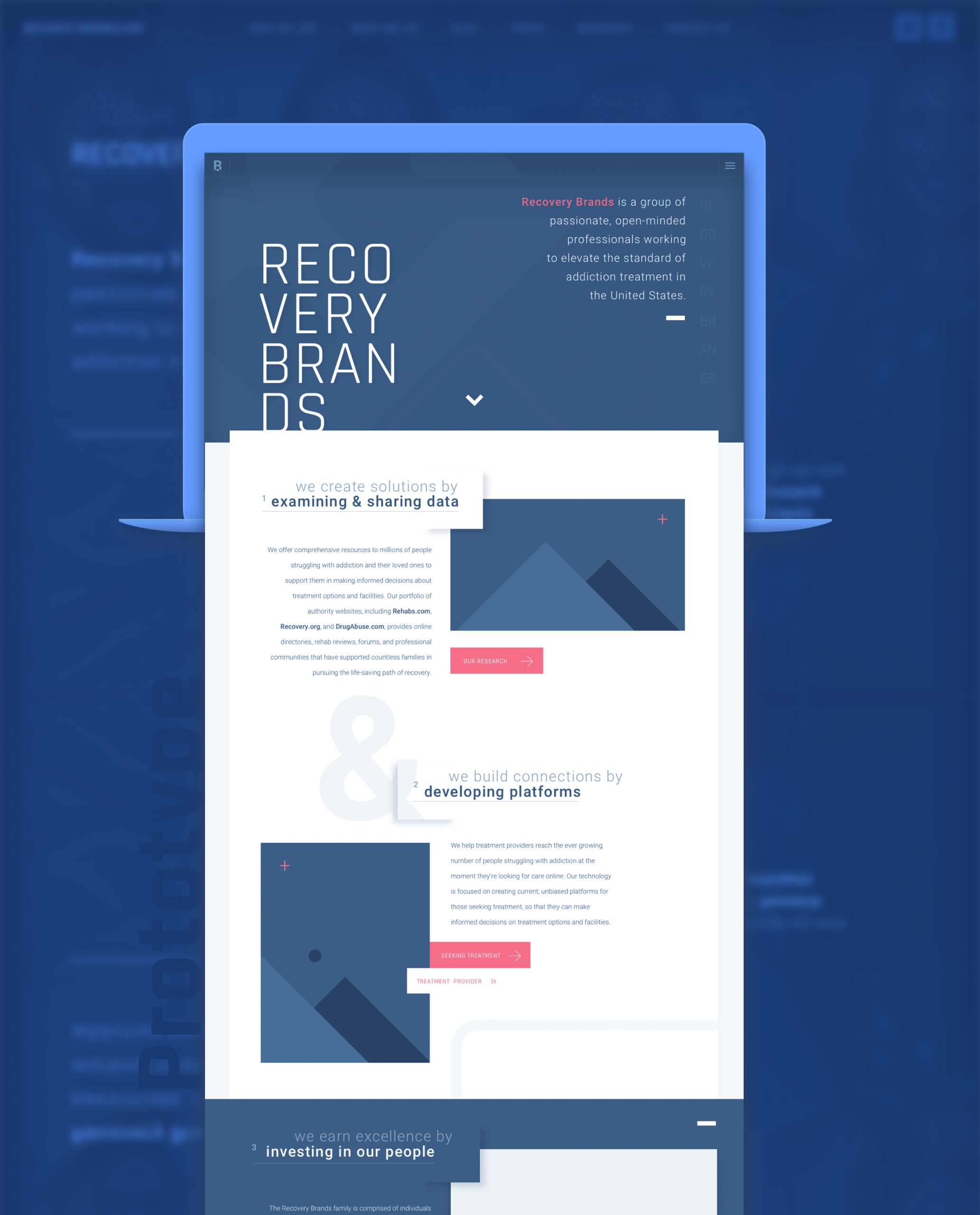
When I joined the Recovery Brands team, we were growing at an exponential rate and the sky appeared to be the limit. Our portfolio of websites and apps steadily ticked over 4 million unique visitors a month and continued to grow. This is a great deal of visibility for a company that seemed to have manifested from nothing and had now become a leader.

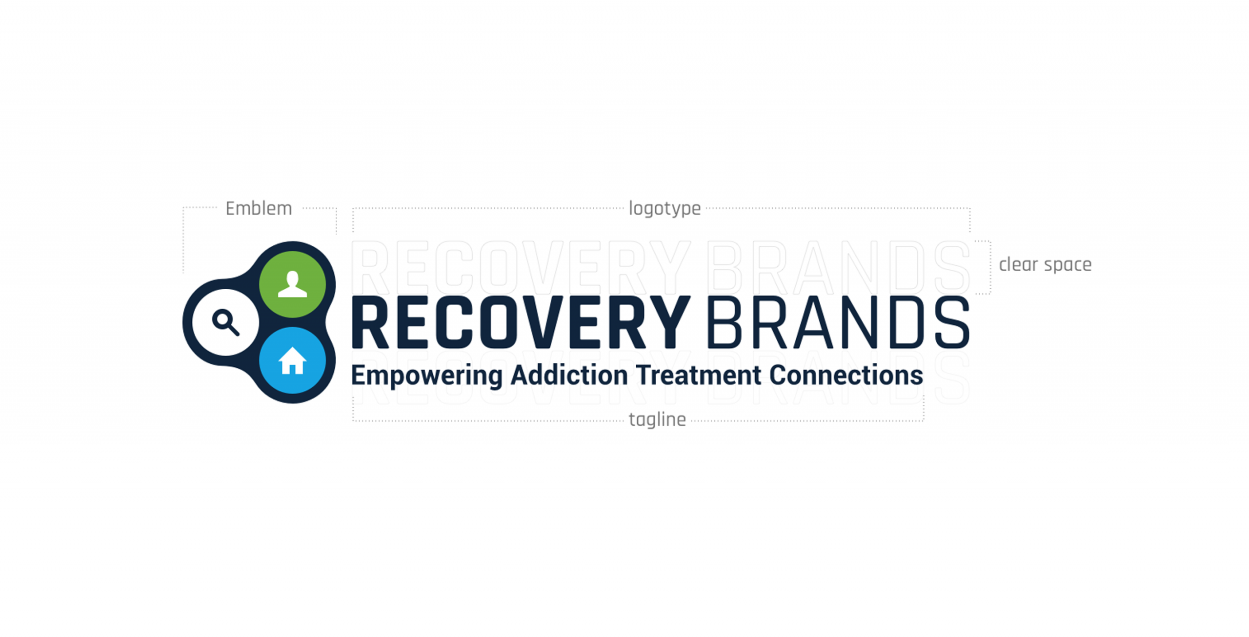
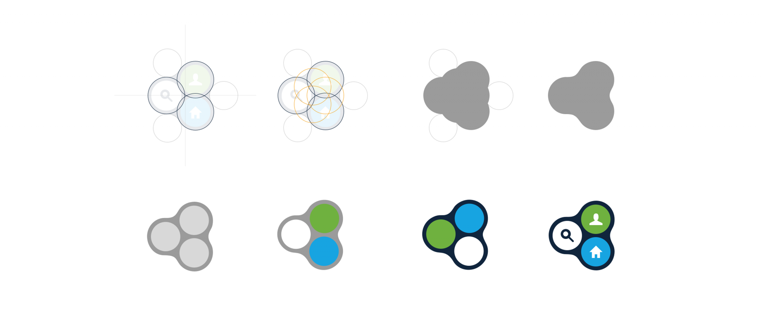
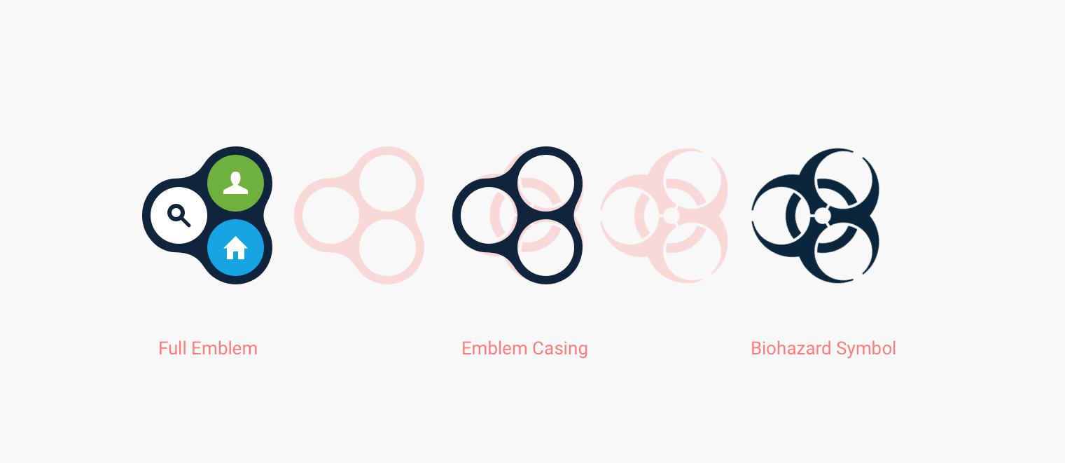
Since the RB portfolio consisted of dozens of unique and independent brands this presented a unique challenge in terms of design. The new identity would have to be poignant and serviceable as a stand alone brand, while also functioning as the foundation for our individual product brands.

Client

Recovery Brands LLC

What I Did

Branding, Web Design, Product Design, UX

Brand Audit

Original Mark

The original mark, albeit serviceable for it its lifetime, needed an update as the company was rapidly growing and was becoming substantially more visible. The approach was to first understand what the original mark and translate that into a something fresh and more flexible.

Below is a reconstruction of the original mark in all of its glory. This was a portion of the audit in which we examine all parts of the existing brand execution and compile the data.

The colors from the original palette were actually quite flexible. A pair of bright highlighting colors being accented by a dark and light variant is about as good as a designer could ask for in terms of assets. I could not trace the derivation of this palette or the curiously playful swatch names, but we were excited to give them different interpretation.

Color Palette
Elephant

#10203D

Curious

#17a4e2

Sushi

#6fb13f

White

#ffffff

Continuing to feed data into the audit were some tests we conducted on the original brand lockup. The consensus with designers was the the original mark was difficult to use on any background other than white without altering it.  The contrast tests showed how difficult it would be to maintain readability across various color applications.

The individual hues performed decent as expected, but with the lockup having all of them present it struggled to remain usable. We definitely took note of these data points and planned to have a more analogous application of the color palette that was both easy to use and highly readable.

Symbolisms & Intent

Breaking down the iconography in the emblem offers us some insight into the original intent of the design. Although simple glyphs were used, the meaning behind the mark seemed to evoke various complexities with our stakeholders. Often times stakeholders being split between those appreciating its simplicity and literal nature and those who disliked it for feeling dated and cumbersome.

Another notable point was how varied the responses were in defining the symbolism. When stakeholders were asked to individually describe what the mark meant the qualitative answers were all over the board, which is something we underscored as a potential improvement point.

Tying directly into the aforementioned spectrum of qualitative answers, is the ordering in which users read the mark. The circle containers within the mark all rest in a sequence that would vary based on cultural convention. This was not a test per se, but all data in an audit is useful if it demonstrates a point of weakness or opportunity for improvement.

Once of the biggest show stoppers of the audit presentation was the slide above that demonstrated how similar the emblem casing resembled a biohazard. Yikes! Were we subconsciously conditioning our users to think of us as toxic? All jokes aside, it was definitely impactful in terms of winning stakeholders over in the necessity of a redesign.

New Brand Concept

Presentation Packet

In addition to presentation materials for the new brand, we created this digital booklet that showcased the new brand identity. We wanted the brand to data based, cohesive with our marketing materials, and consistent through all of our channels of business. This new brand was meant to be more of a culture, an identity which requires more than just a logotype and swatch palette.

Below the booklet are the wireframes for the initial website look. The timing of the project was rather serendipitous, coinciding with the acquisition of Recovery Brands by American Addiction Centers ( AAC ). Thusly, not requiring any further development of this brand.


1
1