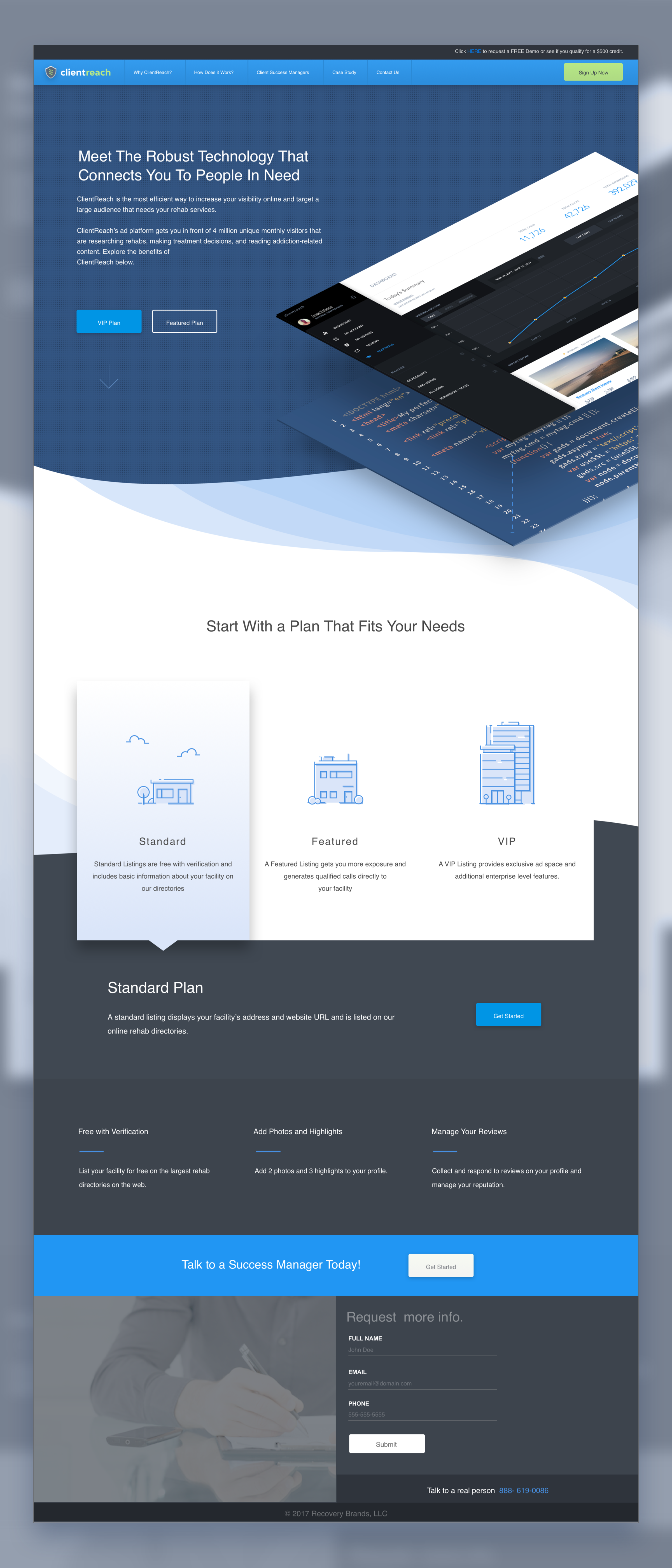
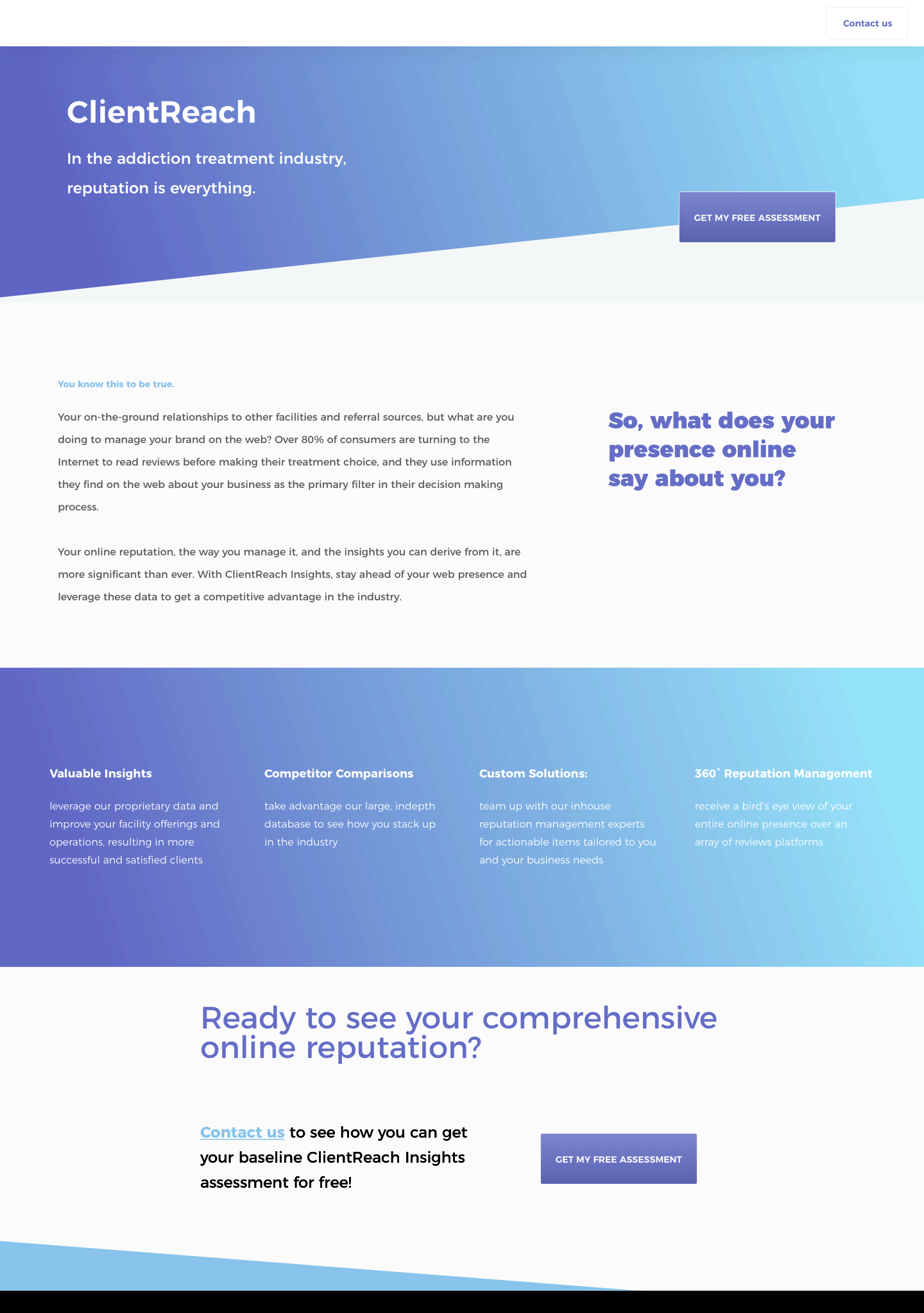
ClientReach is a web app designed to help addiction treatment facilities make meaningful connections with individuals seeking treatment. Through the platform’s profile-based advertising model, facilities nationwide are able to enhance their online brand and increase admissions at lower costs. At the same time, end-users are able to make more qualified and personal treatment decisions based on detailed facility profiles.
Project Overview
Creating a targeted brand identity for an online B2B platform.
Client
American Addiction Centers ( AAC )
What I Did
Brand Development, Marketing, Strategy, Web Design
The Brand
Discovery Process
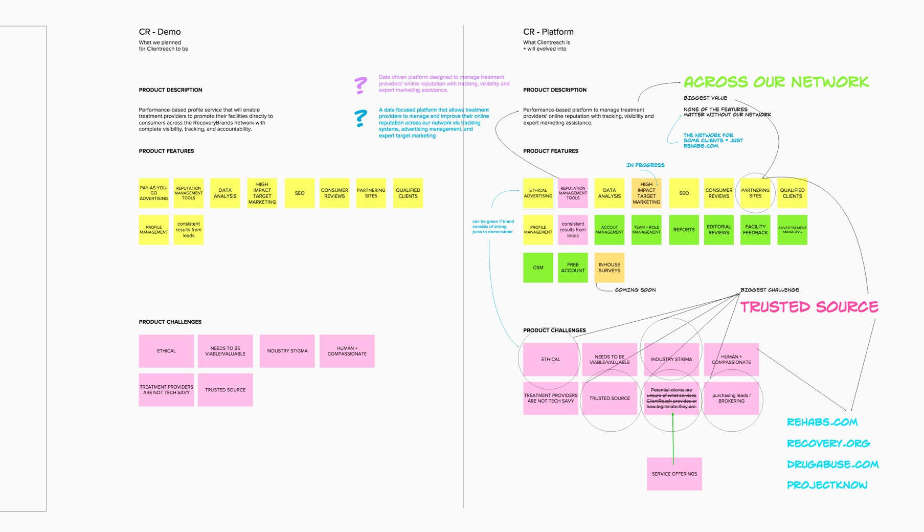
Ideation for this project was done using collaboration software called mural.co. We needed something that would allow remote designers to work freely and creatively and mural was exactly what we were looking for. The seamless board system and screensharing features were perfect for our workflow and below you can see some of those brainstorming sessions.
Idea Board ( mural.co )
Primary Sales Challenge
Potential clients are unsure of what services ClientReach provides or how legitimate they are.
Secondary Sales Challenge
Potential clients find us through Rehabs.com, a website of ours respected for being unbiased and open source, but often hesitate when presented with the option for purchasing leads possibly because of perceptions or legalities
Potential Positions in Space
The first thing we needed to address was in what way this product was to position itself within the intended market. Fortunately, we had mountains of data about our users to inform us on what positioning would likely be the most effective at accomplishing our goals for growth.
After many sessions the team narrowed the offerings for the product position to 3 primary directions. We then developed each ‘brand-type’ into their own unique presentations for stakeholders.
Position A
Big Fish
This direction will focus on marketing Clientreach as the defacto SaaS for lead generation. There is a sense of stability and warranty to positioning as the ‘corporate-giant’. Consumers tend to correlate the size of a company with the quality of a product, which isn’t entirely false given that quality assurance does tend to scale with the size of the production.
In terms of aesthetic, the focal point was boldness and professionalism. Contrasting tones and high saturation were themes used throughout. We wanted this brand to feel data driven and systematic.
Mood & Feel
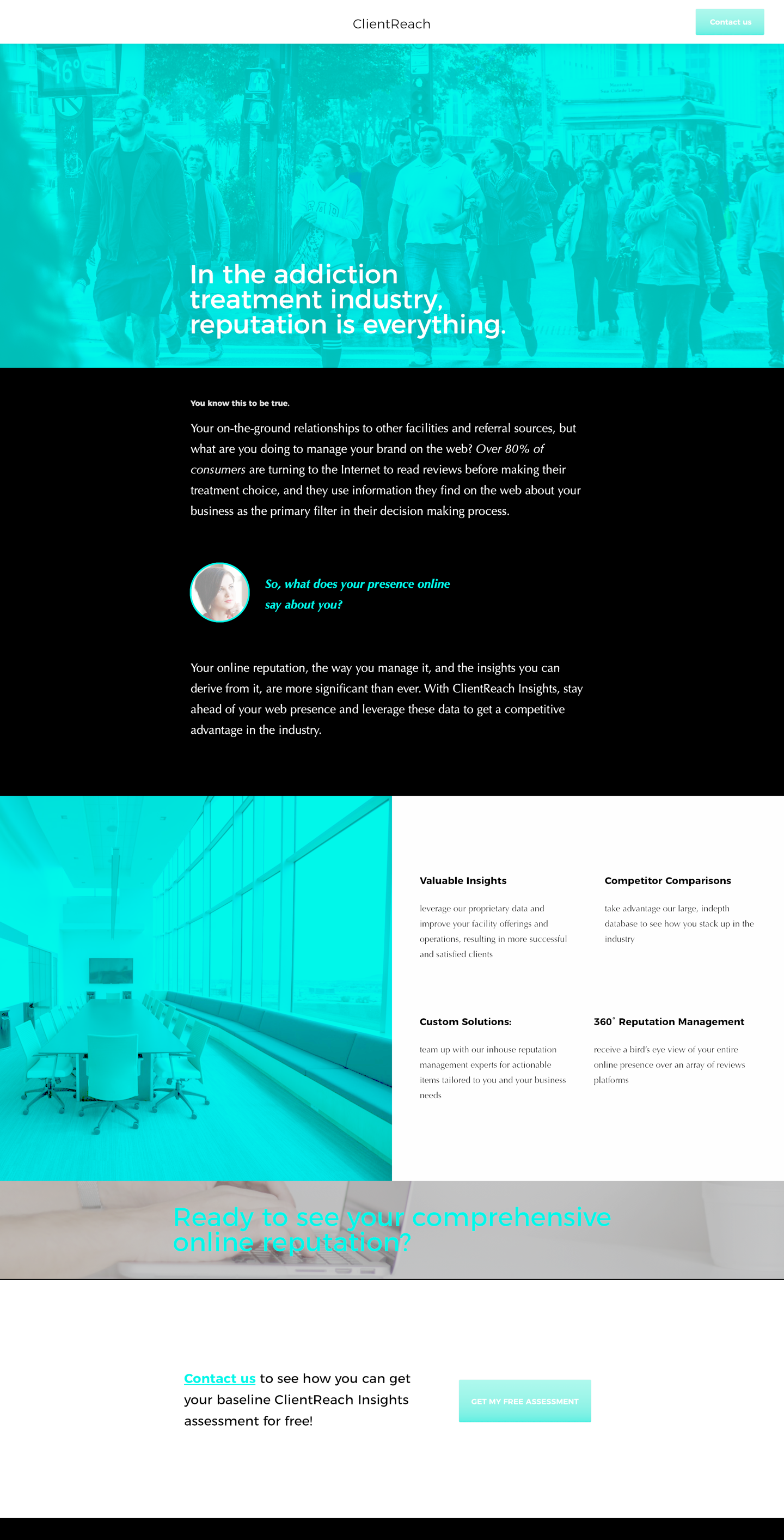
Lander Example
Key Words & Icons
Mark A
Position B
Passion People
This direction focuses on marketing Clientreach as a compassionate company. With the amount of charity work and public services we provide it made sense to position the product to align to such a positive portion of what we do. As stigmatized as the market is such a position would be great for humanizing the company to consumers.
In terms of aesthetic, we aimed for soothing and green tones to lend to a theme of healing, growth, and protection. The colors tended to be more subdued as to align with this theme of healing and softness.
Mood & Feel
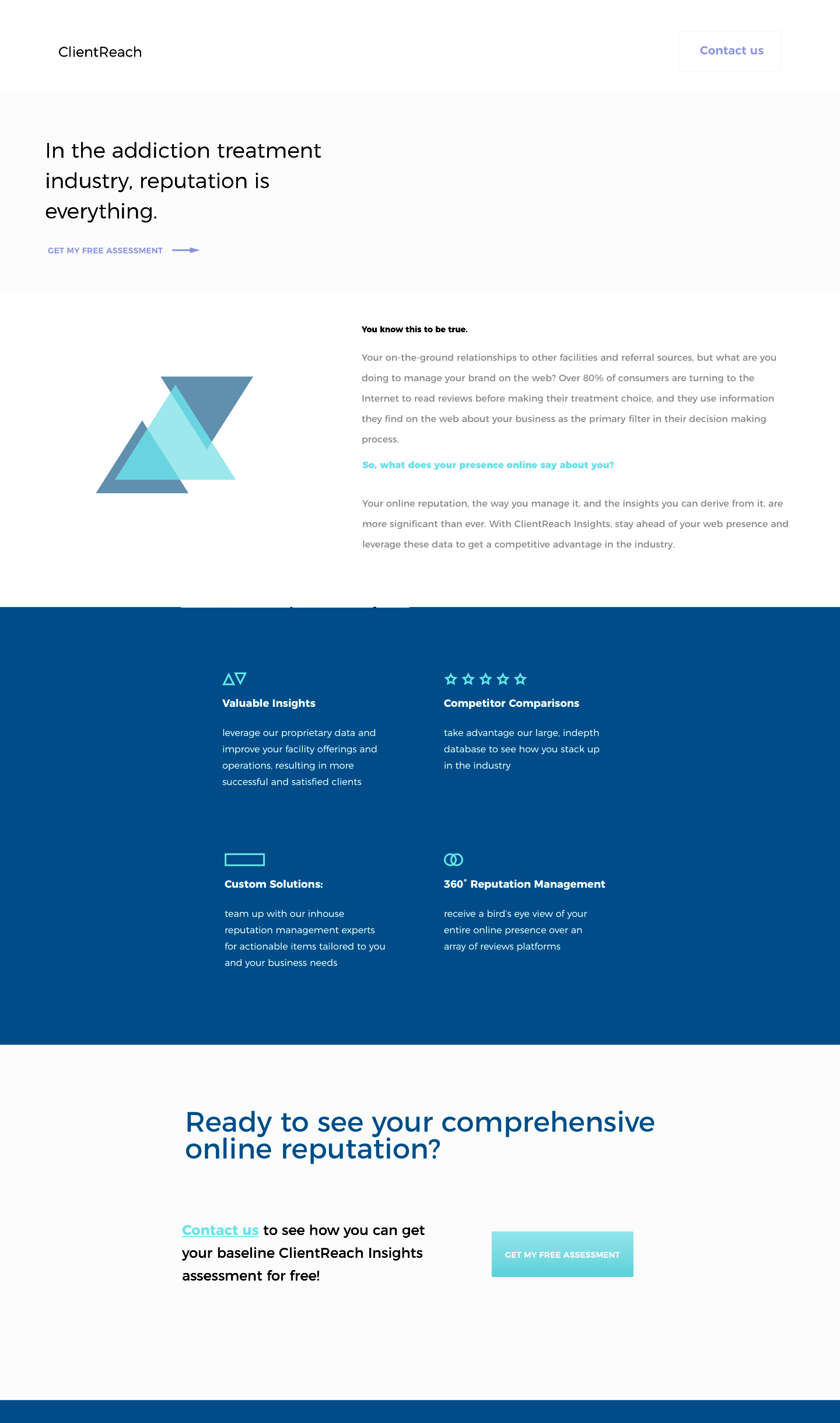
Lander Example
Key Words & Icons
Mark B
Position C
The Friendly Fixer
This direction focuses on marketing clientreach as the ‘do it for you’ SaaS. Following the apple method for marketing product experiences, ClientReach is the magical solution to all of our consumers’ marketing challenges. We were aware that busy managers constituted a large portion of our target audience and nothing makes managers more happy than results without minimal managing.
In terms of aesthetic, the focus here was more playful than the other positions. We wanted it to have a specific level of youth to its design, while still being professional and clean.
Mood & Feel
Lander Example
Key Words & Icons
Mark C
Microsite Design